Upcoming feature: Adjusting Colors for Visually Impaired Persons
Feature ·For individuals with visual impairments, the ability to adjust colors on a digital document can greatly enhance readability. Standard color schemes often lack the necessary contrast and can strain the eyes, making it difficult for visually impaired users to engage with the content. By tailoring color settings to their specific needs, these users can experience improved clarity and reduced eye fatigue, enabling a more comfortable and accessible reading experience.
Color Conversion Postprocessing
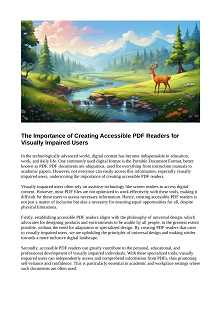
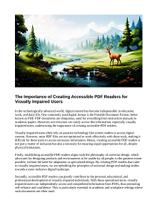
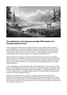
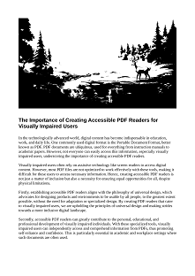
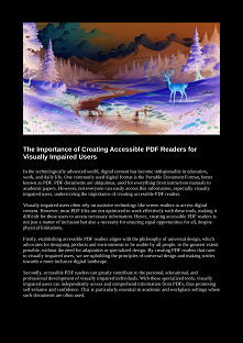
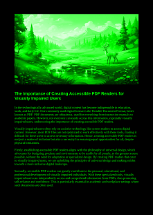
After a document undergoes color conversion using a selected color management system, a crucial step follows: color postprocessing. This step ensures that the colors displayed on the screen accurately represent the user’s preferences. Screenshots will illustrate this process, showcasing how the color conversion and postprocessing work in tandem to deliver the optimal visual output for users with visual impairments.
Invert Colors Mode
Inverting colors is a highly effective mode for enhancing the readability of PDF documents for some visually impaired readers. By reversing all colors on the page—backgrounds, text, images, and other elements—this mode creates a stark contrast. This can alleviate eye strain, particularly in environments with varying light conditions or for users who find standard color schemes glaring or difficult to decipher.
Grayscale Rendering Mode
Grayscale rendering simplifies the visual presentation of a PDF by eliminating color and displaying pages in shades of gray. This reduction in color complexity can help users with color vision deficiencies or those who find color distractions challenging when reading. Grayscale can provide a uniform and subtle backdrop, allowing for focused and prolonged engagement with the text.
High Contrast Rendering Mode
High contrast rendering employs a sigmoid function to amplify the contrast within a PDF document. The enhanced contrast achieved through this method significantly benefits visually impaired persons as it highlights textual and graphical elements with greater distinction. This heightened differentiation allows for quicker recognition of content and eases the strain on the eyes, making for a more accessible and strain-free reading experience.
Bitonal Rendering Mode
Bitonal rendering is particularly useful for creating a crisp, clear distinction between text and background, as it eliminates all shades of gray and renders the PDF in strictly black and white. Sophisticated algorithms transform images in the document into high-contrast, black-and-white versions, stripping down visual complexity. This stark contrast can be instrumental for some users with visual impairments, as it reduces ambiguity and enhances the legibility of text and images.
Custom Colors Rendering Mode
The custom colors rendering mode offers a personalized approach by allowing users to select a foreground and background color of their choice, for example, green text on a black background. This mode can drastically improve the reading experience for those with specific visual preferences or sensitivities. By customizing the color scheme, users can create a bespoke contrast that aligns with their visual requirements, enhancing both the comfort and accessibility of the document.
